The General Layout Considerations
The general layout considerations state that all content on the app needs to be clear at its default size. The users shouldn’t have to scroll horizontally to read any important text or zoom in to see anything such as text or images.
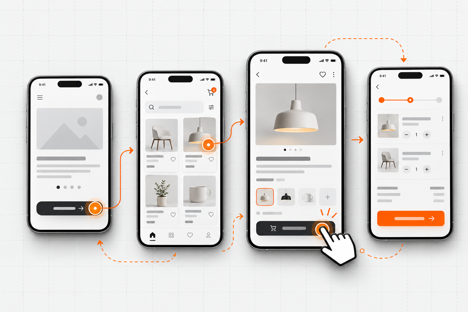
The overall look of the app needs to be consistent throughout the app. All elements such as buttons should look similar and the branding throughout should be the same.
Focus on using visual weight and balance to convey the importance of each item on the app. Simply put large items catch the eye and appear more important than smaller ones. Larger items are also easier to tap, which is especially important when an app is used in distracting surroundings, such as in the kitchen or a gym. In general, items placed in the upper half of the screen need to be your most important elements.
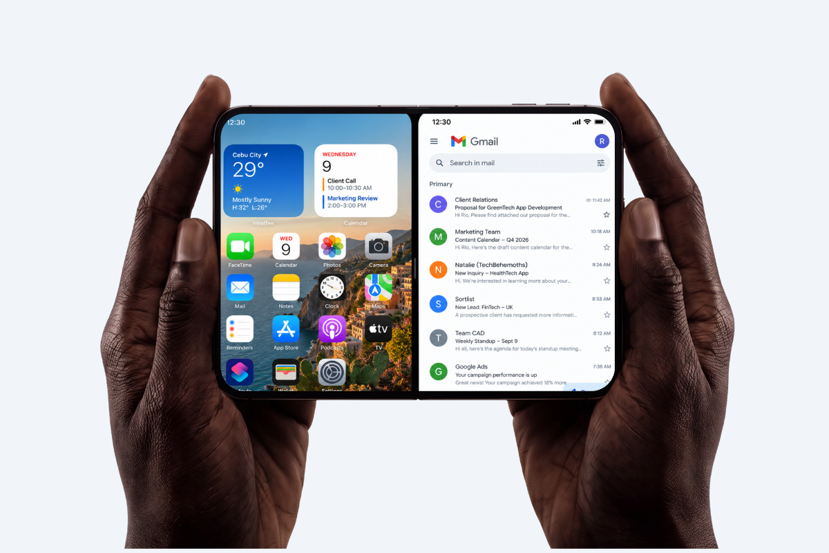
When possible make sure to support both portrait and landscape orientations. People prefer to use apps in different orientations, so it’s best when you can fulfill that expectation.
Be prepared for text-size changes. People expect most apps to respond when they choose a different text size in Settings. We always accommodate text-size changes by making sure our designs support them.
Always allow ample touch targets for any buttons or other interactive elements. Did you know that there should always be at least 44x44 pt minimum tapping area for all controls? So even the biggest of fingers can use it.